If you feel as if your office walls are closing in, you may be right. Managers' and professionals' offices are shrinking -- down as much as 21% since the 1990s, according to one survey.
你是不是感觉办公室四面的围墙有些逼仄?你的感觉或许是对的。据一项调查显示,经理人和专业人士的办公室的确是在缩小──自上世纪90年代以来减小了21%之多。
Designers are finding new ways to make small offices seem larger -- and to make a powerful statement. With the right layout, furniture and accessories, it's possible to convey values such as creativity, authority or collaborative openness in even a tiny space.
设计师们正千方百计让狭小的办公空间能显得更大些──并且能有强大的表现力。只要设计合理,家具和配饰布局恰当,即使是在狭小的空间里也有可能传达出创造力、权威或是乐于合作的开放意识等价值观念。
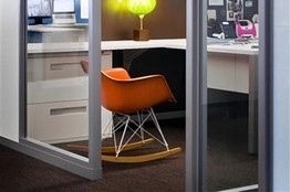
Jeff Berg doesn't have room for much more than a desk and shelves in the 10-by-10-foot office he occupies as a creative director at Olson, a Minneapolis advertising agency. If he meets with more than one co-worker, they sit on the floor. But he still manages to project -- and encourage -- creativity. For his lone guest chair, he chose an orange mid-century plastic rocker. 'It's very hard for people to be anxious in a rocking chair,' he says. A large, glittery disco ball hangs from the ceiling. The message: Working in advertising should be fun, he says. 'It's my way of saying, 'If you come in here, we're going to have a party.''
在明尼阿波利斯一家广告公司Olson担任创意总监的杰夫?伯格(Jeff Berg)只拥有一间10英尺(约合3米)见方的办公室,里面最多只能摆放下一张办公桌和几个书架。如果他需要和两个或更多的同事开会,大家就只能坐在地上。不过他还是得以在方寸之间展示出──并鼓励──了创意。他那唯一一把供来访者使用的座椅,是一把橙色的中世纪塑料摇椅。他说:“坐在摇椅里,人们很难会感到焦虑。”天花板上悬着一只巨大的迪厅闪光球灯。他说,这只大球所传达的信息是:从事广告业应该很有趣。“我用这种方式告诉大家,‘到这儿来,我们就是来开派对的。’”
The private office may get more style scrutiny -- particularly from cubicle-bound colleagues -- as it becomes a rarer prize. Just 32% of employees have private offices, down from 36% in 1997, according to the 2010 survey of 424 office-space managers by the International Facility Management Association, Houston, a professional group. The shrinkage has come as employers cut costs and open up more space for meetings and collaboration. About 63% of middle managers still have private offices, averaging about 120 square feet.
私人办公室的设计风格或许会受到更多的关注──特别是受到那些局在小格子里办公的同事们的关注──因为这已成为一种越来越难得的奖励。根据休斯敦一家行业组织──国际设施管理协会(International Facility Management Association)在2010年对424位办公空间管理者进行的调查,只有32%的员工拥有私人办公室,这一比例低于1997年的36%。原因就在于,雇主们削减成本,而且为了扩大会议场所以及促进员工合作,他们将更多空间改造成了开放空间。大约63%的中层管理者仍拥有私人办公室,平均面积约为120平方英尺(约合10.8平方米)。
Furniture choices speak louder when there's only room for two or three pieces. Stylish pieces that don't scream 'office' can elevate a look. For instance, a classic Eero Saarinen marble table might serve as a desk, placed in the center of the office to lend spaciousness, with a contemporary credenza in a light wood finish along the wall, suggests Asifa Tirmizi, a principal in the New York architecture and design firm Tirmizi Campbell. Nontraditional pieces that combine different furniture styles and eras work particularly well for a person who wants to be seen as a creative change agent, she notes.
当办公室里只放得下两三件家具的时候,家具的选择就显得尤其重要了。那些不与“办公室”挂钩的时尚家居或许能够提升外观形象。比方说,纽约的建筑与设计公司Tirmizi Campbell主管阿西菲?特密兹(Asifa Tirmizi)建议,一张经典的Eero Saarinen大理石桌子或许可以当作办公桌,放在办公室正中以彰显宽敞的空间感,在 边再配上一个淡色木质感的当代风格书柜。她指出,非传统的家具搭配不同风格、不同时代的家具款式,尤其适合那些想要显示自己喜爱推动创新特质的人。
One small-office challenge is hosting colleagues. Down the hall from Mr. Berg at Olson, the worn couch in Dennis Ryan's 8-by-14-foot office invites casual collaboration. Mr. Ryan made room for the couch and two guest chairs by choosing a simple desk. The setup avoids 'creating artificial barriers between people,' says Mr. Ryan, chief creative officer at Olson. Three walls are writable floor-to-ceiling glass, covered with project sketches and goals for clients. Another wall displays jokes and photos to foster 'a sense of play,' he says.
小空间办公室所要面临的挑战之一是如何接待同事。在Olson公司,从伯格办公室出来沿着大厅往外走,是丹尼斯?瑞恩(Dennis Ryan)那间长14英尺(约4.2米)、宽8英尺(约2.4米)的办公室,里面那张陈旧的沙发打造出轻松的合作氛围。瑞恩选择了一张简单的办公桌,以腾出空间放下这张沙发以及两把供客人使用的椅子。这样的布局避免了“造成人与人之间那种人为的隔阂,”在Olson任首席创意长的瑞恩如是说。办公室内有三面 都是大落地玻璃,上面可以写字,已经写满了项目草稿和客户目标。另一面 上贴着笑话和照片,他说,这是为了营造一种“玩闹的感觉”。
Mr. Ryan has held meetings in his office with as many as five co-workers, 'all fighting for the pen, working on the wall together,' he says. While it feels a little like cramming 'five people in a Prius,' he likes the results. 'The small space actually forces intimacy and collaboration, because there's nowhere to hide.'
瑞恩在他的办公室里召开过最多有5个人参加的会议,“大家在一起抢笔,一起在 上工作,”他说。虽然这感觉有点像“把5个人塞进一辆丰田普锐斯”,但他喜欢这样的效果。“小空间实际上能够促进亲密感和合作意识,因为大家无处可躲。”
More managers are opting for a meeting table, paired with a smaller desk, because of the growing number of brief meetings held deskside. A round table has a collaborative feel; folding models on wheels offer flexibility, says Lori Gee, vice president, applied insight, for Herman Miller, a Holland, Mich., furniture designer. Seating guests on bright ottomans or contemporary reclining chairs communicates 'an egalitarian approach,' says Steve Verbeek, vice president, design and innovation, for Teknion, a Toronto-based design firm.
越来越多的管理者如今选择放一张会议桌,再搭配一张小办公桌,因为越来越多的短会议是在办公桌边上开的。在密歇根州霍兰市的家具设计公司Herman Miller担任应用创意副总裁的洛里?吉(Lori Gee)表示,圆桌给人一种合作的感觉;安装轮子的折叠款式则带来灵活性。在总部位于多伦多的设计公司Teknion任设计和创意副总裁的史蒂夫?费尔贝克(Steve Verbeek)表示,让来访者坐在色彩明亮的软垫小凳上或是现代风格的斜躺椅上,可以传达出“一种平等的主张”。
Status-conscious managers have more difficulty projecting an image of authority in a small office. Traditional status symbols such as bulky mahogany desks and trophy walls are pretty much out of the question. Designers are swapping big, dark furniture for desks and tables on lean, lightweight legs. Small spaces seem larger when work surfaces, walls and other materials are pale to reflect light, with colors confined to an accent wall or side chairs, Ms. Tirmizi says.
对职位高低敏感的管理者在小办公室里展现权威形象时,会感觉更为困难。那些传统的地位象征,如笨重的红木办公桌和奖杯 等,基本上已经不可能了。设计师如今将大型的深色家具换成了桌腿又细又轻的办公桌和普通桌子。特密兹称,当工作台面、 壁和其他材质呈现能够反射光线的浅色,而色彩仅局限在某一面主题 或是侧椅时,狭小的办公空间能够显得大一些。
When a Washington, D.C., law firm moved associates to 13-by-10-foot offices during a recent office relocation, the firm chose desks made of anigre wood, a rich but lighter-colored wood. Attaching the desk to a 'work wall' of shelves and files in a traditional 'L' shape conveys permanence and stability, says Catherine Heath, director of interior design in Washington, D.C., for HOK, the architecture and interior-design firm that handled the job. A relatively traditional upholstered wooden guest chair faces the desk.
华盛顿哥伦比亚特区的一家律师行在最近一次搬家时,将办公地点搬到了几间长13英尺(约3.9米)、宽10英尺(约3米)的办公室。这一次,他们选择了由阿林山榄木制成的办公桌,阿林山榄木是一种质地厚实但颜色较浅的木材。常驻华盛顿哥伦比亚特区、在建筑与室内设计公司HOK任室内设计总监的凯瑟琳?希思(Catherine Heath)指出,在摆满书架和文件、并呈现传统L形的“工作 ”边放一张办公桌,可以传达出持久感和稳定感。HOK承接了这家律师行新办公室的室内设计工作。办公桌对面是一把相对传统的供访客使用的软垫木质椅子。
The glass front wall of each office extends around the front corners, creating a bay-window effect that makes the space feel larger, Ms. Heath says. The back wall is covered in pale yellow, and light from a hidden fixture overhead 'washes down the wall like sunshine,' drawing the eye back. Light has an enlarging effect, and research shows bright areas near walls can draw the eye and make the space appear larger.
希思说,每一间办公室前面的玻璃 从前面的拐角处延伸出去,打造出一种飘窗的效果,这样使得室内空间感觉更宽敞。后 刷成淡黄色,头顶隐式的灯具散射下来的灯光“如阳光一般从 壁上倾 而下,”将人们的视线吸引回来。光线有一种放大的效果,而且有研究显示,在 壁附近的明亮区域可以吸引视线,让空间显得更为宽敞。
Extending the horizontal area of a room has a bigger effect on users' perceptions of spaciousness than extending height, says a 2011 study in the journal Environment and Behavior. Furniture can be arranged to keep horizontal sight lines clear. When shelving is 'layered' beneath desk surfaces to create hidden storage space, 'your eye doesn't see all the clutter,' says Vanessa Bradley, advanced applications manager at Steelcase, Grand Rapids, Mich.
《环境与行为》(Environment and Behavior)期刊发表的一项2011年进行的研究显示,就使用者的空间感受而言,扩大房间的水平面积比延伸高度效果更为明显。在安排家具时,可以让水平视线更为清晰。如果把储物架摆放在办公桌桌面下方,打造出一块隐藏的储物空间,“你就看不到所有乱七八糟的杂物了,”在密歇根州大急流城的Steelcase任高级应用经理的瓦妮莎?布拉德利(Vanessa Bradley)表示。
A 'huge theme' in furniture design is dual- or triple-purpose furniture, says Robert Arko, creative director in San Francisco for Coalesse, a design unit of Steelcase. File cabinets topped with fabric-covered cushions can double as chairs, sliding under a desk or table when they're not in use. Ottomans double as storage bins and stools. Work surfaces adjust from sitting to standing height so employees can change positions. As offices get smaller, Mr. Arko says, 'the space needs to work harder.'
在旧金山的Coalesse任创意总监的罗伯特?阿尔科(Robert Arko)称,如今家具设计的一个“巨大主题”是家具的双重或是三重功用。Coalesse是Steelcase旗下一家设计子公司。装文件的橱柜上面加一层织物覆盖的软垫,便可以兼做椅子使用,不用的时候就推到办公桌或是桌子下面。软垫小凳可以当成储物柜,也可以用来做小凳子。可调节的工作台面,可以从坐姿高度调节到站立高度,以便员工调整姿势。阿尔科说,随着办公空间变小,“所有空间必须得到更充分的利用。”
With space so tight, differences in how men and women choose to use it loom larger. Women tend to like more storage for the bags they carry, such as an upright, wheeled receptacle that can slide under a desk where a trash bin might go, says Steelcase's Ms. Bradley. Stephanie Fanger, a workplace strategist with Goodmans Interior Structures, a Phoenix office furniture dealer, says men devote more space than women to tech gear, adding elaborate wall mounts for multiple computers and tablets. Men also tend to choose massive desk chairs with broad backs, while woman opt for light, airy ergonomic chairs with webbed backs, Ms. Fanger says.
鉴于空间如此紧凑,男性与女性在选择如何使用空间方面所显示的差异也尤为突出。Steelcase的布拉德利说,女性往往喜欢有更多空间来存放她们的箱包,比方说一个直立带轮子的柜子,能够推放到办公桌下方那个通常放垃圾桶的位置。在凤凰城一家办公家具经销商Goodmans Interior Structures任办公空间策略师的斯蒂芬妮?范杰(Stephanie Fanger)指出,相对于女性,男性会将更多空间用来摆在科技设备,他们更愿意添加壁挂来放置多台台式电脑和平板电脑。范杰称,男性还更倾向于选择很大且带宽厚靠背的办公椅,而女性则会选择轻便、通气、有网状靠背的舒适易用的座椅。
Even small offices are prized by their occupants. A 2013 survey of 2,000 white-collar workers by Gensler, a design and architecture firm, found that employees' satisfaction with their work space has fallen since 2008 because many can't find a quiet place to focus. Despite a sharp increase in office space devoted to teamwork, the time employees spend collaborating has fallen 20% since 2008, while time spent trying to focus is up 13%. The survey links trouble focusing with lower job satisfaction and poorer job performance.
即便是狭小的办公室,也让其拥有者珍视。设计与建筑公司Gensler在2013年针对2000名白领员工展开的一项调查结果显示,自2008年以来,企业雇员对他们办公空间的满意度有所下降,因为许多人找不到一个可以集中精神办公的安静所在。尽管用于团队合作的办公空间明显增加,但企业员工花在合作上面的时间却自2008年以来减少了20%,而用来试图集中精力的时间增加了13%。这次调查将人们难于集中精力这一现象同工作满意度的下降以及工作表现变差联系在了一起。
Olson's Mr. Berg spends much of his time at work outside his office, in open zones for meetings, calls and conversation designed for his employer by Gensler. But when he needs to think, he says, 'I need clarity and I need some quiet space. When I have to be focused, my office is fantastic.'
Olson的伯格有很多工作时间都不是在他的办公室里度过的,他会去那些由Gensler为他们公司设计的开放区域开会、打电话或与人交谈。但是当他需要思考问题时,他说,“我需要头脑清晰,我需要一些安静的空间。当我不得不集中精力时,我的办公室是个绝妙的去处。”


