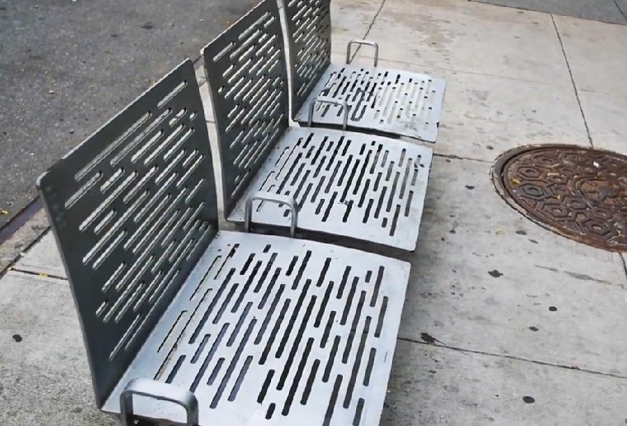
Why are cities full of uncomfortable benches?
为什么很多城市的座椅都让人感到不舒服?
This one has armrests to prevent you from dozing off.
这把椅子有扶手,以免大家打盹时从椅子上摔倒。
Here’s another — again with the arms, the stiff metal.
这也是一把椅子,也有扶手,材料是坚硬的金属。
And this one — it’s brand new.
这把椅子……还是全新的。
The MTA in New York began installing them as part of a subway enhancement plan.
为改善地铁环境,纽约交通运输局安装了这种椅子。
And they don’t call it a bench. They prefer the term "leaning bars."
他们不把它叫做椅子,他们更喜欢“靠栏” 这种叫法。
So what if i told you it was designed with discomfort in mind?
要是我告诉你这种椅子专门让人不舒服,你会是什么反应?
New York City is filled with some of the most innovative architecture and urban planning in the world.
纽约遍地都是全世界最具创意的建筑,最具创意的城市规划。
Today, nearly every kind of public space here is has been developed with close attention to detail.
如今,几乎各个公共场所的设计都非常注重细节。
So these benches are no mistake.
所以,这些椅子根本没有问题。
They are designed to allow you to sit but not get too cozy.
这种设计就是为了让你有地儿坐,但是不会坐得太舒服
And that is intentional.
他们是有意让你不舒服。
The concept stems from a school of thought that goes by many names, but today we'll use "defensive design."
这一概念可以追溯到某种理念,虽然它有各种各样的叫法,但我们要说的是“防御性设计”这种叫法。
Defensive design is about moderating behavior.
防御性设计旨在规范人们的行为。
The goal is to limit the ways an object can be misused.
其设计目的是在于让人不会过分误解它的用途。
These benches have armrests because that will prevent anyone from laying down.
这些椅子有扶手,这样就避免了有人往上面躺
Their short back is another nod to say, "This bench isn’t yours forever."
这一缺点正面意思是说,“这个椅子不是你个人的。”
This trend is worldwide. And it’s not just in the benches.
这种防御性设计并非美国才有,也并非只体现在椅子的设计上。
When you start looking for defensive designs in New York City, you’ll find examples everywhere.
只要你留心纽约的防御性设计,你会发现这种设计到处都是。
It’s the presence of security cameras in subway turnstiles or Times Square.
包括地铁里的十字专门以及时代广场等地的安全摄像头,
It’s these spikes on this column, meant to deter birds.
石柱上用于驱鸟的长针;
It’s the knobs on these ledges, to discourage skateboarders.
包括为了阻止有人在上面滑滑板而设置的这些横档,
And there were once sprinklers underneath the awning of this bookstore, to prevent people from sleeping there.
这家书店为了防止有人在这里过夜而在雨棚下安装的洒水喷头。
It's sidewalk barriers. It’s even these regular streetlights.
以及人行道上的路障,甚至还包括这些普通的街灯。
Yeah. streetlights are probably some of the most recognizable defensive designs.
没错,街灯可能是防御性设计最引人注目的实例之一。
When they surfaced in the 19th-century Western cities, the dynamic of urban life changed.
十九世纪,这种灯刚刚在一些西方城市露面,就改变了城市生活的面貌。
Because of them, more people spent time outside at night, which drove economic development and a reduction in crime.
有了这些街灯,越来越多的人晚上选择呆在外面,不仅促进了经济发展,还降低了犯罪率。
Most hostile architecture tries to influence behavior in a similar way.
大多数看似不友好的设施都意图用同样的方式来规范大家的行为。
The designs attempt to make public space a bit more hospitable, more ideal.
这些设计是为了让公共场所变得更舒适、更理想。

Defensive designs can deter crime.
防御性设计的确能够预防犯罪,
It can prevent the destruction of public property.
避免公共财产受损,
And it can prevent loitering.
同时避免大家到处游荡。
But there is a reason why defensive design is characterized as “hostile.”
然而,防御性设计之所以让人感到“不友善”是有原因的。
Take the example of the leaning bar.
我们还是来说说椅子。
Disability advocates have a problem with that appearing in the MTA.
有残障权益保护人士就交通运输局的这一设施提出了疑问。
One advocate pointed out that "People who travel who have disabilities or just get tired sometimes
其中一位倡议者指出,“旅游的人,残疾人,又或是走路走累了的时候
need a bench to sit on, not a wall to lean against."
大家需要的是能坐的椅子,不是一堵只能靠一靠的墙。”
And while no one likes an uncomfortable bench,
然而,虽然大家都不喜欢不舒服的椅子。
these additions mean something more for people who are experiencing homelessness.
对那些无家可归的人来说,这些设施还是有一定作用的。
The United States is currently experiencing a decline in the overall homeless population.
目前,整体上,美国流浪人口的数目正在下降,
But in New York, the homeless population is growing.
然而,纽约的流浪人口仍在增长,
About 1800 people were found to have been sleeping in the subway.
大约有1800人晚上都睡在地铁里。
That’s because emergency shelter isn’t always a viable option.
这是因为应急避难所并非总是可行。
There are several examples of hostile architecture that target people who are homeless.
一些不友好的设施针对的就是流浪人口。
These designs imply that public space is not where homeless people should be.
这些设计暗示着,公共场所不是流浪人口应该呆的地方。
As it goes, city planners have a dilemma — how do they design inclusive cities?
这样一来,城市规划者们就会左右为难:包容性城市应该如何规划?
As for the enhanced subway initiative, the MTA’s mock designs highlight new USB ports and electronic signage in stations.
就改善地铁设施的提议而言,运输局在模拟设计方案强调了地铁站内新的USB接口以及电子标识系统
But you won’t find any press materials highlighting this uncomfortable bench.
然而,没有一份材料强调这种不舒服的椅子。
Excuse me, the "leaning bar."
抱歉,是“靠栏” 。
That’s because it makes for an uncomfortable discussion about who we design public space for — and who gets left out.
因为这会引发讨论冲突,这些公共场所到底是为谁设计的,又有谁是被忽视了的?


