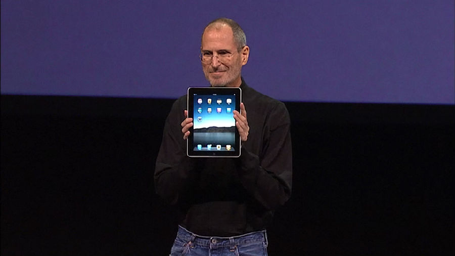
The tablet project got a boost in 2007 when Jobs was considering ideas for a low-cost netbook computer.
2007年,乔布斯在考虑低成本上网本计划时,意外推动了平板电脑项目。
At an executive team brainstorming session one Monday,
在某个周一的一次头脑风暴会议上,
Ive asked why it needed a keyboard hinged to the screen; that was expensive and bulky.
艾弗说,为什么要在屏幕旁边装上键盘呢,那样又贵又笨重。
Put the keyboard on the screen using a multi-touch interface, he suggested.
他提议利用多点触摸界面,将键盘的功能纳入屏幕中。
Jobs agreed. So the resources were directed to revving up the tablet project rather than designing a netbook.
乔布斯对此表示赞同。于是,苹果公司放弃了设计上网本的想法,将资源投入平板电脑项目,令其快速运转起来。
The process began with Jobs and Ive figuring out the right screen size.
平板电脑项目伊始,乔布斯和艾弗需要研究出合适的屏幕尺寸。
They had twenty models made -- all rounded rectangles, of course -- in slightly varying sizes and aspect ratios.
项目团队设计了20个模型--都是圆角矩形,但大小和长宽比赂有不同。

Ive laid them out on a table in the design studio, and in the afternoon they would lift the velvet cloth hiding them and play with them.
艾弗将模型排列在设计工作室的桌子上,下午大家一到,就可以揭开罩在桌上的丝绒布,摆弄这些模型。
"That's how we nailed what the screen size was," Ive said.
“我们就是这样确定屏幕尺寸的。”艾弗说。
As usual Jobs pushed for the purest possible simplicity.
乔布斯一如既往地主张最为纯粹的简洁设计。
That required determining what was the core essence of the device.
这就需要明确平板电脑的核心本质。
The answer: the display screen. So the guiding principle was that everything they did had to defer to the screen.
答案就是显示屏。因此,平板电脑项目的指导原则即是,所有功能和设计都必须服从屏幕的需要。
"How do we get out of the way so there aren't a ton of features and buttons that distract from the display?" Ive asked.
艾弗问道:“怎样才能不让众多功能和按钮分散对于屏幕显示的注意力?”
At every step, Jobs pushed to remove and simplify.
在每一个步骤上,乔布斯都会推进删除和简化。
At one point Jobs looked at the model and was slightly dissatisfied.
有一次,乔布斯看着模型,略有不满。
It didn't feel casual and friendly enough, so that you would naturally scoop it up and whisk it away.
他认为模型不够自然和友好,无法让人随意地拿起来。
Ive put his finger, so to speak, on the problem: They needed to signal that you could grab it with one hand, on impulse.
艾弗敏锐地指出了问题所在:平板电脑的形状要让人觉得有冲动去拿,而且可以随意用一只手就抓起来。
The bottom of the edge needed to be slightly rounded, so that you'd feel comfortable just scooping it up rather than lifting it carefully.
边缘的底部需要再圆润一点,这样会让人觉得拿起来很舒服,而不用小心翼翼地抬起来。
That meant engineering had to design the necessary connection ports and buttons in a simple lip that was thin enough to wash away gently underneath.
这意味着,必须把必要的连接接口和按钮都设计在平板电脑的边缘,同时设备的边缘又很薄,薄到让人忘却它的存在。


